Afterimage House occupies a former print workshop where artists are invited to make work in public. The identity needed to hold both the building’s industrial memory and a programme that changes shape every six weeks.
A system that leaves a trace
The visual language begins with registration marks, overprinted colour and captions that refuse the centre. Electric blue identifies the institution; vermilion moves through each season as an active curatorial voice. A flexible wordmark sits quietly while project titles grow to architectural scale.
Across printed matter, wayfinding and screen, every composition holds one deliberate misalignment. The result feels collected rather than polished: an identity that remembers the hand, the press and the room.
From muted shell to public signal
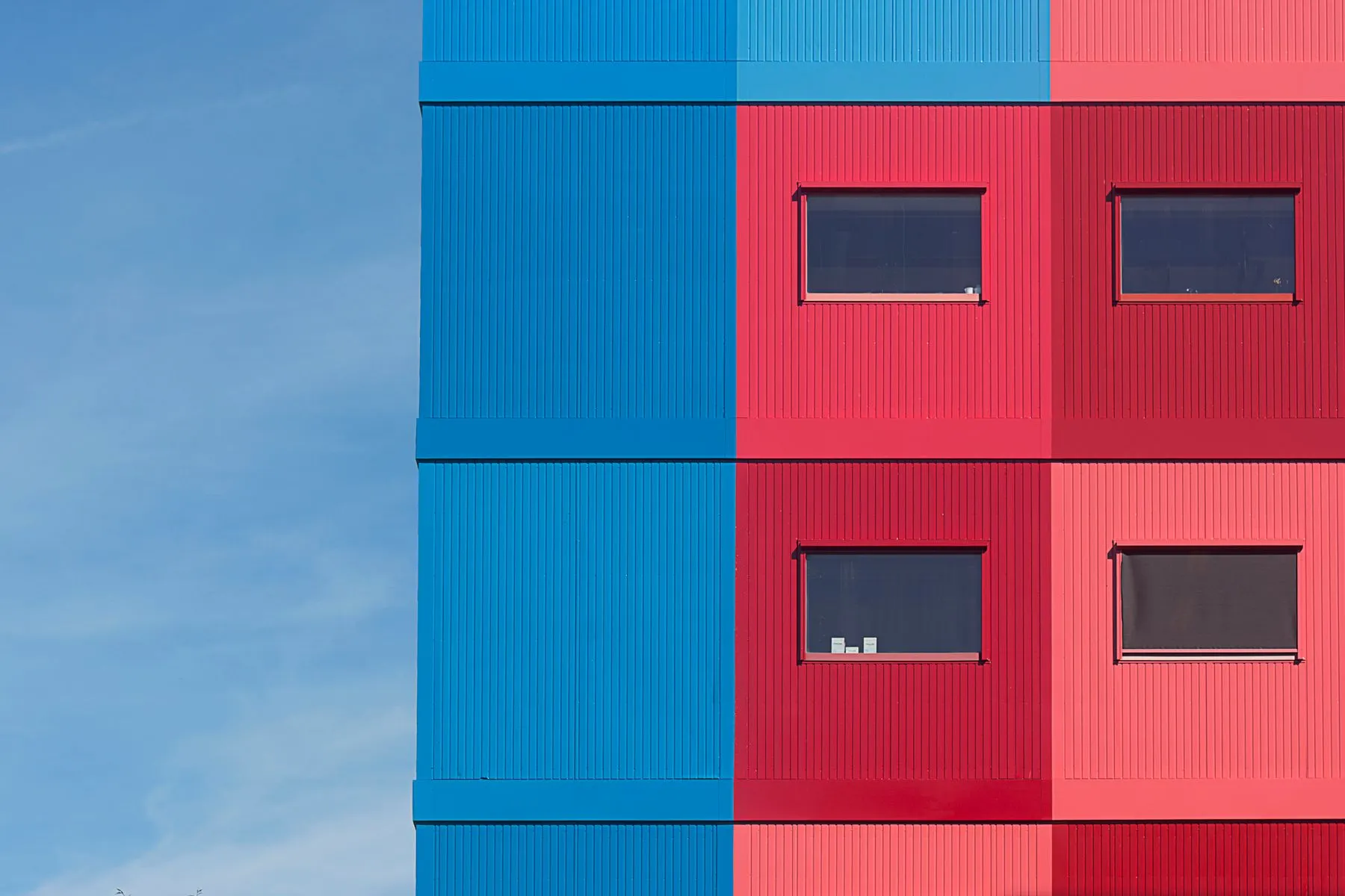
The facade study tested how one decisive colour intervention could make the venue visible without masking its structure. Drag the comparison to inspect the shift from the original neutral elevation to the final public-facing treatment.